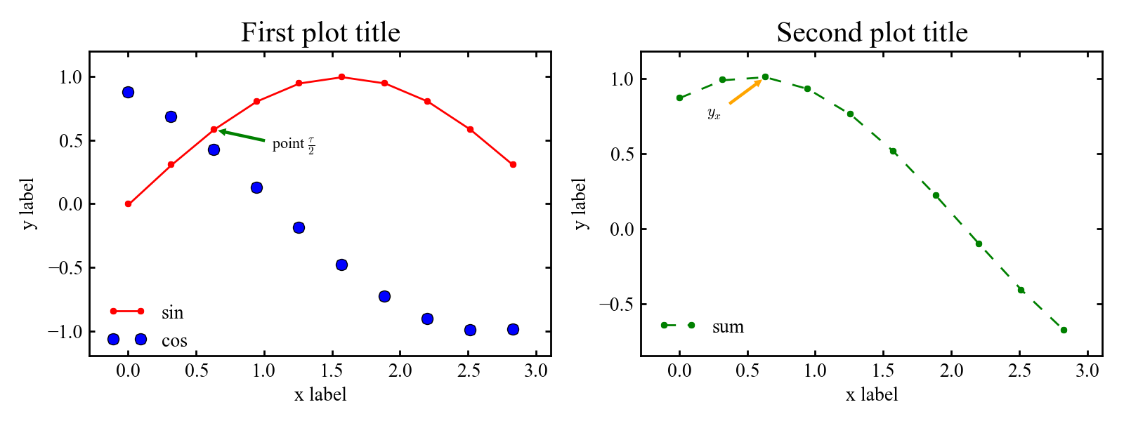
I used to use gnuplot for creating plots with arbitrary data. The main problem was postprocessing the data before plotting: I had to integrate the postprocessing into the calculation code itself or write an additional script to do so. I’d like to provide an example of good-looking plotting with Python and matplotlib. Python has batteries included, so there will be no problem with preparing the data to be plotted.
Example script plot_example.py:
 1#~/usr/bin/env python
 2#-*- coding: utf-8 -*-
 3
 4import matplotlib.pyplot as plt
 5
 6# set global settings
 7def init_plotting():
 8    plt.rcParams['figure.figsize'] = (8, 3)
 9    plt.rcParams['font.size'] = 10
10    plt.rcParams['font.family'] = 'Times New Roman'
11    plt.rcParams['axes.labelsize'] = plt.rcParams['font.size']
12    plt.rcParams['axes.titlesize'] = 1.5*plt.rcParams['font.size']
13    plt.rcParams['legend.fontsize'] = plt.rcParams['font.size']
14    plt.rcParams['xtick.labelsize'] = plt.rcParams['font.size']
15    plt.rcParams['ytick.labelsize'] = plt.rcParams['font.size']
16    plt.rcParams['savefig.dpi'] = 2*plt.rcParams['savefig.dpi']
17    plt.rcParams['xtick.major.size'] = 3
18    plt.rcParams['xtick.minor.size'] = 3
19    plt.rcParams['xtick.major.width'] = 1
20    plt.rcParams['xtick.minor.width'] = 1
21    plt.rcParams['ytick.major.size'] = 3
22    plt.rcParams['ytick.minor.size'] = 3
23    plt.rcParams['ytick.major.width'] = 1
24    plt.rcParams['ytick.minor.width'] = 1
25    plt.rcParams['legend.frameon'] = False
26    plt.rcParams['legend.loc'] = 'center left'
27    plt.rcParams['axes.linewidth'] = 1
28
29    plt.gca().spines['right'].set_color('none')
30    plt.gca().spines['top'].set_color('none')
31    plt.gca().xaxis.set_ticks_position('bottom')
32    plt.gca().yaxis.set_ticks_position('left')
33
34init_plotting()
35
36# plotting example data
37from math import sin
38from math import cos
39
40x = [0.31415*xi for xi in xrange(0,10)]
41y1 = [sin(xi) for xi in x]
42y2 = [cos(xi + 0.5) for xi in x]
43y3 = [cos(xi + 0.5) + sin(xi) for xi in x]
44
45# begin subplots region
46plt.subplot(121)
47plt.gca().margins(0.1, 0.1)
48plt.plot(x, y1, linestyle='-', marker='.', linewidth=1, color='r', label='sin')
49plt.plot(x, y2, linestyle='.', marker='o', linewidth=1, color='b', label='cos')
50
51plt.gca().annotate(u'point $\\frac{\\tau}{2}$', xy=(x[2], y1[2]),  xycoords='data',
52                xytext=(30, -10), textcoords='offset points', size=8,
53                arrowprops=dict(arrowstyle='simple', fc='g', ec='none'))
54
55plt.xlabel(u'x label')
56plt.ylabel(u'y label')
57plt.title(u'First plot title')
58
59plt.gca().legend(bbox_to_anchor = (0.0, 0.1))
60
61plt.subplot(122)
62plt.gca().margins(0.1, 0.1)
63plt.plot(x, y3, linestyle='--', marker='.', linewidth=1, color='g', label='sum')
64
65plt.gca().annotate(u'$y_x$', xy=(x[2], y3[2]),  xycoords='data',
66                xytext=(-30, -20), textcoords='offset points', size=8,
67                arrowprops=dict(arrowstyle='simple', fc='orange', ec='none'))
68
69plt.xlabel(u'x label')
70plt.ylabel(u'y label')
71plt.title(u'Second plot title')
72
73plt.gca().legend(bbox_to_anchor = (0.0, 0.1))
74# end subplots region
75
76# output resulting plot to file
77plt.tight_layout()
78plt.savefig('graph.png')
I’ve set all the important parameters for myself: font, font size, the width of the different types of lines, titles, and labels, so you can change them to fit your needs. The PNG output can be changed to EPS or PDF.
The first part of the script is an init function. It sets some global matplotlib parameters (so you do not need to edit your matplotlib rc file). You can edit the parameters.
The second part is the preparation of the data to be plotted. You can replace it completely with your own code — for example, to load data from a file.
The third part is creating the plots. You can add only one plot to a figure (to do so, remove the second plot and the subplot statements). You can add more plots to one figure (change subplot accordingly). The three numbers are the rows of plots, the columns of plots, and the plot number. For 2x2 plots use subplot(22x), where x is the plot number.
Result: